
作品欣赏

品界设计 | 上海飞橙摄影 FEI CHENG
室内设计:品界设计Interior Design: Scope Design主创设计:品界主创团队Creative Design: Scope Design Main Creative Team设计参与:品界深化团队Design Participation:Scope Design Deepen the team项目地址:上海Project Address: Shanghai空间类别:商业空间Space Category: Commercial Space设计风格:现代Design Style: Modernism项目面积:2000㎡Project Area:2000㎡项目坐落于上海-79意库文化创意园,这座既有传统的古典与雅致,又有国际都会的现代与时尚的“魔都”里。它是桔子摄影旗下开创的一个新兴品牌,面向年轻态的客群结构 - 他/她们拥有更多元的文化、审美和价值观。创造一些场景,去营造更年轻的消费环境与体验氛围,成为我们设计的驱动力。“年轻、女性、时尚、肖像”这些与飞橙摄影产生联系的关键词,汇聚成青春的蓬勃、生命的美好与灿烂,为年轻而生,在美丽的时代,绽放美丽的自己。△ 外观 Appearance△ 咖啡厅 Cafe△ 接待展示厅 Reception Hall△ 艺术走廊 Art Corridor△ 选片区 Selected Area△ 休息区 Rest Area△ 礼服区 Dress Area△ 化妆间 Dressing Room△ 数码部 Digital Department△ 卫生间 TOILET

品界设计 | 奔赴星球 - 桔子威海路星球店 - 实景作品

品界设计 | 最美婚纱博物馆 - INSGII因只婚纱艺术馆 - 实景作品
主创设计 | 品界主创团队设计参与 | 品界深化团队项目地址 | 福建 · 厦门空间类别 | 商业空间设计风格 | 现代主义项目面积 | 2000㎡ 9年的沉淀 INSGII因只婚纱艺术馆 2000㎡全新空间开幕一改传统仓储式的空间陈列方式 WEDDING SHOPPING MALL 的概念也将馆藏的70+个品牌2000+件婚纱礼服完整展示ONE思考“ 婚纱艺术馆的空间从已经远去的 Sex and the City 式的热闹与招摇,再到近几年极简纯白设计都让我们重新思考该如何给予空间全新的叙述。”与国内外奢品婚纱品牌合作的经验成就了INSGII因只多元文化背景,也是我们的思考基底之一,而过去一年多的疫情似乎让所有的文化都拉回在了同一个维度,当身处至暗时刻,个体的温度与光芒将被无限放大。我们尝试将这样的语境复刻在空间里,大面积的墨色背景,婚纱在灯光的加持下散发出或温润或耀眼的光芒,更多的细节被感知,其设计灵感中的文化设定都能在这里肆意散发。这是一场关于生命力的仪式在空气中产生微震通过艺术联觉的方式向身处空间的人们传递品牌美学TWO浪漫“对着星空许愿似乎是童年专属的纯真联想,当每一位踏入INSGII因只的客人路过一片星空内心默默许下遇见梦想嫁衣的愿望就是一种本能的浪漫设定。”设计师在空间内分别设置了星空顶和不锈钢球体装置艺术,它们被赋予释放或汇聚、微弱或新生、耀眼或沉稳的含义,也刷新了我们对日常事物的印象:当星星、鸡蛋等微小事物通过放大尺寸、通过罗列整体,从而变成不可被忽略的部分。深埋于品牌核心的一句话:「穿上你的梦想」被融合在星空顶设置的初衷里。THREE记忆“婚纱馆空间既是一种关于新婚的集体记忆,又是每一对新人独立的个人记忆,这种记忆的双重性更加凸显了婚纱馆空间设置的重要性。”「INSGII因只」将国内外知名婚纱品牌聚集,形成极具力量的独特时尚语言,无论对INSGII因只品牌本身或是婚纱行业而言,都是一种不可被忽视的创造性表达。而我们所要做的是创造一个INSGII因只式美学空间,去承载更多新人关于「爱的独家记忆」。FOURShopping Mall“已经被市场检验过的纯白环境、INS风装饰似乎适合更加简单的、甚至是理所当然的选择,但我们更希望能够创作出一些能够与你的生活更加熟悉、放松的形式——Shopping Mall。”“INSGII BRIDAL GALLERY”采用Shopping Mall的形式将不同品牌的婚纱置于不同的空间里,客人以极其轻松的姿态在品牌独立空间内沉浸于品牌设计师想要通过婚纱和礼服表达的话语。FIVEOnly For You" 无数次的场景还原和记忆回顾,斟酌每一个物件摆放的位置与角度、香氛的弥漫范围、音乐的情绪传达,因为你,只为你。"试纱间与试妆间的表达形式则是另一种感官法则。在INSGII因只创立之初,便确定了「婚纱,是服装的艺术,更是服务的艺术」基调,这样不可避免成为空间设计的底色之一,因此,试纱间与试妆的设计带有浓郁的服务意识。从客人出发,明亮色调的6个试纱间与2个试妆间,将私密性、舒适性、专业性教科书式呈现。ABOUTINSGII因只在第九年这个时间点似乎无论谈论过去或是未来都显得合乎时宜:九年足以让一个品牌去通过鲜活的、充满张力的记忆与经验叙述一段关于成长的叙事;当镜头拉长,九年也不过是画面的三五帧,在即将步入品牌十周年的途中,如何将INSGII因只品牌的美学延续,成为一个新的课题。无论是ALVIN集团董事长欧晋,还是INSGII因只主理人家宜,他们都试图从INSGII因只九年的时间线里,寻找足以挑拨感知想象力的线索。于是,我们首先开始谈论空间。尝试在有限的空间里组织一场无限的五感之间的游戏。 ——ALVIN

品界设计 - 深圳成天都想吃 · 成都小吃集(上梅林店 )- 实景作品
生活也该像阳光一样缤纷多彩,而非千篇一律、两点一线。我们联合成天都想吃 · 成都小吃集,描绘了一份美食歇息站的蓝图,供你参考。本次小吃集的设计项目位于福田区奥士达路,是相对繁华的路段,众多美食爱好者经常光顾这里。本项目是一个年轻的美食品牌,我们首先要做的正是树立其独特的品牌形象,打造一家形象鲜明的店面。室内设计/品界设计主创设计/品界主创团队设计参与/品界深化团队项目地址/广东 · 深圳空间类别/餐饮空间设计风格/现代风格项目面积/200㎡早中晚:干拌串串、脆冒鸭肠、鸡丝凉面、冒鸭血、红糖糍粑……令人食指大动的小吃美食在不同时间里该如何选择?“用简单的方式,解决复杂的问题”我们在店内设计了一墙成都特色小吃的画报,开始了一天“成天都想吃”的美食故事。可拼合的卡座、规则分布的餐桌,灵活的座位形式,为热情肆意的空间氛围奠定坚实基础。空间动线格局一目了然,就像成都人火热的性格,或者如这火辣的成都小吃,毫无保留的拥抱每一位食客的到来。“美食歇息站”绝不是珍馐玉馔的堆砌,而应是层层把关、精心甄选,成天都想吃对美食是这样,我们对空间也是。木格栅墙面、裸露的天花管线,看似粗犷的设计被带有成都古建筑色调的砖红色协调统一;弧形的吊顶、透明的吊灯,木色的酒桶,相对圆润的细节又被前者打破 ...对比与碰撞产生的动态平衡,让空间时刻保持活力。生活远不止千篇一律的两点一线,放缓脚步,停下歇息,也许就能看见美好生活的样子。

品界设计 - 深圳柒城影像 SEVENCITY IMAGE - 实景作品
在这个三维世界里发生着的空间对话,那么耐人寻味,摆脱传统概念的束缚,关于空间的想象到底能飞多远?深圳柒城影像 SEVENCITY IMAGE一个关于“城市、生活、年轻、态度”的赋新空间,设计师以品牌理念为母题,将“生而有品”的态度进行空间的转译,试图还原一个极富时尚及生命力的有态度的复合商业空间。室内设计 / 品界设计主创设计 / 品界主创团队设计参与 / 品界深化团队项目地址 / 深圳空间类别 / 商业空间设计风格 / 现代风格项目面积 / 3000㎡△门厅开门非山,设计师使墙壁略微倾斜,展现出强度和结构美感。这不是一个一眼就可以看尽的空间。它打破了传统的方正,显示出了“君子置于危墙下”的紧张感,有种超现实的感官体验,整个门厅利用斜角的墙体在布局中打造视觉上的变化,形成空间的特色。皮革、玻璃、金属等以穿插的手法,向内打开空间的戏剧张力,如影片的花絮般,不同的片段(材质)的叠搭,作为空间的伏笔预告着漫步其中的洄游递进之妙。△艺展区沿着动线探寻,艺术涂料与金属材质以硬朗的意象平衡着空间气质,斜面棱角与直线线条的交错,米灰底色与光源的二次折射带来的迷离感,让人仿佛置入朦胧与幽深虚境之中。△接待区△选片原始建筑中,高低的梁体密布在空间顶部,于是交错的块、面被设计师解构重组,封锁整个顶部空间,几何分割和块组合,又从上到下向三维空间延伸,创造了纵横维度上丰富的体验。片墙界定空间暧昧关系,立柱在虚与实之间形成隐喻、连续的介质,平滑过渡的线条与参差的块面相互对话, 完成「轻」与「重」的对峙。△礼服区△男装区隐匿式光源,在明与暗之间实现自然过渡,丰富空间立面表情。点线面的交汇流动,相较于平面的多样构成,设计师更强调动线上的重叠——错综延伸的视线,柱梁与横面的关系,朦胧写意的光线、非对称的布局,在动与静,虚与实之间找到介入的融合点。△化妆区

品界设计 | 5000㎡桔子摄影嘉善基地 - 实景作品
一个有互动性的具有展示性的空间 。它能让人和空间和产品产生一些互动,可以行走、可以驻留。在产生关系的那些碎片里,可以细品,发现它独特的尺度感,产生一些交织和惊喜。项目面积 / 5000㎡主设计师 / 品界主创团队设计参与 / 品界深化团队项目地址 / 浙江-嘉兴空间类别 / 商业空间设计风格 / 极简主义灯光设计 / 有束光照明设计项目坐落于浙江嘉善美丽的碧云花海农场,为品牌方占据了有利的资源。定位为当代拒绝被定义的年轻群体,生活与创新,感性与理性引发出设计师思维散发再创造。从当代⽤户的新需求出发,重新洞⻅他们的审美、喜好、态度,以年轻化的新主张,开启⼀场与主流客户之间的对话之旅。接 / 待 / 区RECEPTION AREA与空间不期而遇倾斜的墙体 造型更像是表达一种存在感一种区别于规矩中正的美和空间相结合 向一个纬度丰富了这种美感的厚度探寻三维空间中最惬意的姿态不突兀却又冲击访者感官礼 / 服 / 区DRESS AREA一些元素的碰撞造物有方整个礼服展示空间,我们将“方”作为表达的主要元素。 方,是对直线条及大面积体块的运用,将空间的功能属性内置于方正的结构形体之中,呈现出一种理性的克制和冷静的内敛。造物不可方在局部细节上品牌LOGO心动熊,以不同的造型——桔色的、幻彩的、千层镜层叠的活跃了整个空间成了来往人群探索体验后的又一触发点其 / 他 / 空 / 间OTHER SPACE与“光”同行大量的人造光源,在材质表面蕴晕,为内敛的空间营造出一种温润感。顺着光的方向,是有着包裹感的空间,是在空间内创造空间的尺度的调适。以点,线,面的铺陈来表达物质和形式。围合形式的存在建立了直接的屏障去实现内外的相对性同时,它是光影的途径 是将阴影的形状和明暗的交替直接表达给我们的载体

品界设计 | ' 奢 ' 范生活 - ( 漳州建发·玺院 )
成功背后的转身如同生活的圆满阔绰的气度需要与之匹配的宽度-△色 系这个复式空间是由上下两层平层打通构建的,设计师基于业主自主想法,合理设计格局以及当代审美风格,最后拎取轻奢中的一些元素与极简风结合,大量运用了大理石、岩板及金属元素,诠释了一个低调奢华的舒适空间。主创设计:品界主创团队设计参与:品界深化团队项目地址:福建漳州 空间类别:住宅空间设计风格:现代主义项目面积:300㎡设计说明:HALLWAY' 艺术 ’入户玄关,用艺术涂料打底衬托黑色艺术装置,渲染一层空间的艺术氛围。转开隐形门上的铜把手,是一层的公卫和儿童娱乐空间。由灰色烤漆全面包裹,强调了空间的整体性和协调性。Living and Dinning‘ 欢聚 ’△客厅奢华不是靠一些繁复的夺人眼球的装饰来体现,客厅选用了整面岩板作为电视背景,亮面的材质与金属结合,简洁大气,让空间自然透出低调奢华的感觉。△餐厅一说到岛台,可能都会想到开放式厨房,这里业主选择的是传统的封闭式厨房,餐厅与厨房并不在一个空间中,为了美观性,也为了实用性,设计师选择了岛台与餐桌结合的设计。岛台底部做储物柜,可以放置一些餐具,电器,方便业主备餐,减少业主厨房餐厅两头跑的路程。岛台饰面也选用岩板,同样是岩板,设计师在细节上也做了区分,虽然材质相同,但表层做了肌理的设计,让同一个空间中的餐厅与客厅在做到呼应的同时又有自己的特色。宽敞舒适的操作台面给日常生活提供了便利,同时也贴合现代生活的需要,形成日常欢聚的社交空间。△艺术楼梯楼梯是一层的个性设计,采用钢结构做踏板骨架,表层贴上岩板,成大小不一的方块状,错落有序的造型,叠加往上,在空间的转换中像一首递进的旋律呈现着它的韵律,愉悦着你的感官神经。Staircase Hall‘ 光线与影像 ’△楼梯厅拾级而上,就到楼梯厅了。它是整个二层空间的中转站,链接二层的每个私人空间。吊顶镶嵌波纹板,在灯光映照下呈现特有的纹路,钢的材质,与楼梯墙上的钢质雕塑,隐隐呼应。圆形的镜面结构传递着光线与影像,优化整个中转站的氛围和环境。Master bedroom space‘ 奢华质感 ’整个主卧空间是业主喜好的完全体现。将近80平的面积,占据大半的二层空间,主卧、主卫、更衣室、水吧台被适宜的梳理规整。△水吧台&主卫门△主卧‘舒适质感’,是主卧给人的直观感受。灰与奶咖的配色,提升了空间的格调。床头两边的弧面造型,包裹了与床头软包同材质的面料,在暖光下,折射出不同的调性,让空间的层次更加丰富。纵深近5米的飘窗将天空和美景纳入视野,精致的家具与艺术美陈,体现着对生活品质的追求。△主卫淋浴房的背景是整块奢石,漂亮的纹路提升空间的档次。金属线条与大理石纹瓷砖相结合,在暖光的氛围下,‘奢’的内涵被展现得淋漓。让泡澡淋浴都是一种品质的享受。Locker Room‘ 开合之间 ’△更衣室更衣室的设计简洁中带着精致,玻璃柜门框上金属边框,开合之间,变化的着装与搭配。中心 'bling bling' 的华美吊灯,在玻璃柜门的反衬下,整个更衣室有种富丽堂皇的感觉,迎合了业主对高级奢华的追求与喜爱。Other space‘ 家的呼吸 ’△茶室△厨房△次卧一△一层公卫△次卧二△次卫△生活阳台俯瞰云端尽揽临湖美景与一城繁华-

品界设计 | MU慕婚纱摄影-超级工作室 | 实景作品
主创设计:品界主创团队Creative Design: Scope Design Main Creative Team设计参与:品界深化团队Design Participation:Scope Design Deepen the team项目地址:江苏-苏州 Project Address: Suzhou, Jiangsu空间类别:商业空间Space Category: Commercial Space设计风格:现代主义Design Style: Modernism灯光设计:有束光Lighting design:Delicht材质研究:比直涂装Material Study:Bizhi coating项目面积:3000㎡Project Area: 3,000㎡设计说明:Design Description:当日地陷东南Long ago the earth dipped downwards in the southeast这东南一隅有处曰姑苏And in that southeast part was a city named Gusu有城曰阊门者And the quarter around Changmen Gate of Gusu最是红尘中一二等富贵风流之地Was one of the most fashionable centres of wealth and nobility in the world of men. 背景BACKGROUND 位于苏州市姑苏区的文化创意产业园内占据着整个建筑体是一个超级摄影工作室A super photography studioLocated in the Cultural and Creative Industry Park in Gusu District, Suzhou CityOccupying the entire building△外立面 “慕”来源于法语Amour,意为爱 The name“MU”(慕) comes from the French word Amour, which means love.品牌主打故事感、情绪感、仪式感系列婚纱照巧妙运用创意园旧工业风建筑在人文气息浓郁安静的环境中创作The studio focuses on shooting wedding photos with a sense of story, emotion, and ceremony.Cleverly use the old industrial-style buildings in the Creative Park.Create in a quiet and culturally rich environment.材质 MATERIAL 灰色的艺术水泥作为墙面和地面的主要材料Grey artistic cement is usedas the main material for walls and floors.为简洁的空间赋予神秘而原始的质感Give the people standing in this concise spacea mysterious and primitive feeling.搭配黑色艺术涂料与灰色系艺术水泥形成视觉反差小部分的辰砂红成为空间的唯一色彩Black art paint and grey art cementform a visual contrast.A small part of cinnabar redbecomes the only color in the space.△前厅室内与周围的建筑在视觉上形成了对比There is a visual contrastbetween the interior and the surrounding buildings色系灵感INSPIRATION OF COLORSMATERIAL 色彩灵感来源于苏州建筑采用经典的「白墙黛瓦 」的配色The colors are inspired by Suzhou architecture which uses the classic ``white wall and black tiles'' color scheme. 五行中金为白色 水为黑色 火为红色 In the theory of five elements, the color of metal is white,water is black,and fire is red.代表中国古代传统的色系在空间里以现代的形式演绎These color systems representing ancient Chinese traditionsare interpreted in a modern form in the space.△休息区| 灰 GRAY |灰是”白”经过岁月的洗礼。加上粗糙化的哑面纹理,赋予体块最原始的材质。Gray is "white" fading over years. The gray color and rough matte texture reflect the most primitive material of the block.| 黑 BLACK |黑为”哑黑”。与青黑对比,饱和度更高的色彩,或与灰同处一个空间内,或单独处之,给人一种高级感。Black is "matt black". In contrast to blue black, this kind of color with higher saturation, whether used with gray or alone, will give people a sense of high-level.| 红 RED |此处的红,称之“辰砂”,是指中国传统色彩名称。据五行之说,南方属火,故又以赤为南方之色。让人联想到:太阳、火焰、热情,运用此色以示醒目。The red here, called "Cinnabar", refers to the traditional Chinese color name; according to the theory of five elements, the south is fire, so red is the color of the south. It very eye-catching.is reminiscent of the sun, flames and passion.空间塑造 SPACE SHAPING 外立面的其中一角,墙体以斜切的方式,将人们的视觉中心引入到室内;整齐排列的竖向体块,平添一种端庄的秩序感与节奏感。In one corner of the facade, the wall is obliquely cut to introduce people's visual center into the room; the neatly arranged vertical blocks add a dignified sense of order and rhythm.△艺术画廊我们把江南园林的廊道注入室内空间中。入门沿着视线往右看,是一条直廊,用于原创作品展示,以黑色的顶、地包裹着。靠近窗的两面片墙不完全落地,人们径直行走移步异景,室内外之间似乎可进行对话。In designing the indoor space, we adopted the corridors of Jiangnan gardens. Looking to the right along the line of sight, the entrance is a straight corridor for the display of original works. The whole corridor is wrapped with a black roof and floor, and the two walls near the window are not completely floored. When people walk straight inward, they will see different sceneries. There seem to be conversations between indoors and outdoors.△礼服橱窗△女礼服区二层礼服区过道,模仿江南园林中的复廊。两廊之间隔着一道墙,两条过道都可以通行,透过墙上的漏窗或门洞,可观看对面的景致。The aisles in the formal dress area on the second floor mimic the complex corridor in Jiangnan gardens. There is a wall between the two corridors, and both aisles are passable. People can watch the scenery on the opposite side through the leaky window or door opening on the wall.在采光面单一的空间中,我们想创造出更多的自然光线,便利用墙顶之间的缝隙,布置一条条灯带,看上去仿若由天棚外洒下来的光。In such a space with a single lighting surface, in order to create more natural light, we make use of the gaps between the tops of the walls to lay light strips, which looks like the light spilled from the ceiling.△男礼服区二层礼服区的“高级黑”,是衬托婚纱的色系。非黑,无以显其白;非白,无以利其黑。整体空间用方体来进行阐述,顶面与墙连成一道红色弧形,打破空间的平静感。The "premium black" in the formal dress area on the second floor is the color to set off the wedding dresses. If it is not black, there is no way to show its white; if it is not white, there is no way to benefit its black. The overall space is illustrated with cubes. The top surface and the wall form a red arc, breaking the calmness of the space.空间镜头的镜面世界让人犹如置身于虚幻的门洞之间,沉浸在无限序列的空间中。The mirror-like world in the space lens makes people feel as if they are in an illusory doorway and immersed in an infinite sequence of space.几何 GEOMETRY 序列 | 选片区和礼服区都应用片状的墙面,竖立于空间中,充满秩序感与体块感的隔断作为空间的分隔。展示区采用回字形的艺术吊灯,光线均匀散落在展台上,为原本冷静的结构,增添不少氛围。Sequence | Both the selection area and the formal dress area use sheet-shaped walls, which are erected in the space, and the orderly block partitions are used as the separation of the space.The exhibition area adopts the art chandelier in the shape of a back shape, and the light is evenly scattered on the booth, adding a warm atmosphere to the original calm structure.△一销产品展示区△选片区穿插 | 前台与展示台都在原本的几何空间中,插入横向的方体结构。这种相互穿插的形式,离地横向生长,如同浮木漂浮在水面。Insertion | In the original geometric space, both the front desk and the display stand are inserted into a horizontal cuboid structure. This inserting form grows horizontally off the ground, like driftwood floating on the water.△二销产品展示区体块 | 空间的规划是以体块相互之间的关系,形成各自独立的区域。Block | Space planning is based on the relationship between the blocks to form separate areas.融合 MIX 灰、黑、红三种材料之间的碰撞与平衡以几何的室内造型构建空间的视觉感官冲击Collision and balance among gray, black and red materialsConstructing the visual sensory impact of the spacewith geometric interior modeling△化妆区过道在这座人文气息浓郁的城市一隅,以一种新的姿态生长着In a corner of this culturally rich city, it is growing with a new attitude

品界设计 | 漳州|DL·KIDS达令影像 | 实景作品
每个瞬间就像记忆里的光斑 集结成网 丰沛我们的一生 定格瞬间 Freeze frame moment室内设计|品界设计Interior Design|Scope Design主创设计:品界主创团队Creative Design: Scope Design Main Creative Team设计参与:品界深化团队Design Participation:Scope Design Deepen the team项目地址|福建-漳州 Project Address|Fujian, Zhangzhou空间类别|商业空间Space Category|Commercial Space设计风格|极简主义Design Style|Minimalism项目面积|500㎡Project Area|500㎡设计说明:Design Description:△平面彩图DL·KIDS 01BACKGROUND 背景 项目位于漳州标新文化产业园内,摄影师是一个懂得写故事的灵魂捕手,用菲林组成一部专属的经典人生。与以往的婚纱摄影机构保持一致的是,依然以极简的手法来书写儿童摄影新篇章。DL·KIDS 02INSPIERATION 灵感空间灵感来源于达令LOGO,提取字母“DL”为形态,贯穿于整个空间中。大小各异的D和L串连起这个门头,一部分为通透的玻璃材质,使得室内外相互贯通,透空部分的形态,恰好可以成为拍摄取景框。外立面上半部分恰当的留白,给予门头足够的视觉焦点。当阳光洒下时,留下一抹树影斑驳稀疏的景象。DL·KIDS 03COLOR SYSTEM 色系蛋壳色的艺术漆作为空间的主要材质,搭配暗黄色艺术漆,干净、柔和的色彩,贴合孩子纯净的心灵。在人们印象中,儿童空间似乎都脱离不开五彩缤纷的色彩。对孩子来说,色彩与线条各有其固定的意义,无需太过活跃,只要有适度的亮点,在我们看来单一色系是环境的一种底色,以此便能衬托出儿童独有的心境。DL·KIDS 04R A D I A N 弧度流动的曲线,具有弧度美的空间需要宽敞的,但不是仅此而已。流畅通透的弧线曲面造型,带领儿童进入幻想中的精神地带、获得心灵上的喜悦感,相较一往无常的方正,显得刻板、严肃。然而,与弧线的有机结合却显柔和与宁静感。等待区的几处墙面,巧妙地加入三角形、椭圆形的内凹发光体,独属于儿童的趣味性符号,在如洞穴堡垒的空间里,留下最独特、纯净的儿童摄影空间。DL·KIDS 05E V O L U T I O N 演化D - 是有弧度的。由弧形进而演化成拱门,行走在每一条过道都如身处在洞穴之中,能引人渐入。从选衣开始,到化妆,再进入影棚,连接成一条通道,循序渐进。在进入化妆间的顶部,半圆弧的开口设计、立体拱门视觉化,给人一种引此入内的仪式感,两个倒置的字母D,刻划出了前台柜体。L - 是流动的弧线楼梯,穿过洞穴来到了另一个异想天地。拍摄完成的照片,都由此处通往选取。其作为一二层空间的共通,脱离背景颜色,形成独具一格的视觉焦点。服装区挂衣杆排排整齐挂立,满足不同年龄段的使用需求。以孩子的视角看待,由此设置成高低不一的杆,回形动线,让挑选者流连驻足其中。

品界设计 | 概念式设计X奢华美学空间-克洛伊三亚新店
『 从高端到奢华,是一场革变突破的升级一种前所未有的高度』▽ 花房▽ 水吧台▽ 手作饰品区▽ 男卫▽ 女卫▽ 卸妆区

品界设计 | MIX HAIR SALON狭缝中的理发店 | 实景作品
随着生活水平的提高,美发行业逐步向年轻化、精细化、品质化方向发展,转型升级过程加速,突破了人们对沙龙空间的固有认知。因此,在空间品质上也应做出相应整合,让客户精神层次上体验更为丰富。With the improvement of living standards, the hairdressing industry is gradually developing in the direction of youthfulness, refinement and quality, and the process of transformation and upgrading has accelerated. All these breaks through people's inherent cognition of salon space. Therefore, corresponding integration should be made in improving the quality of the space, so as to enrich the customer's spiritual experience.MIX& SCOPE DISIGN室内设计:品界设计Interior Design: Scope Design主创设计:品界主创团队Creative Design: Scope Design Main Creative Team设计参与:品界深化团队Design Participation:Scope Design Deepen the tea空间类别:商业空间Space Category: Commercial Space设计风格:极简主义Design Style: Minimalism项目面积:100㎡Project Area: 100㎡设计说明:Design Description:你认识什么样的美你就会发现什么样的美你就会创造什么样的美出来没有人会拒绝美,不管多忙人们都会停下脚步,步入美发店对自己进行一番修饰 ...What kind of beauty do you knowYou will find what kind of beautyYou will create what kind of beautyNo one will refuse beauty. No matter how busy they are, they will stop and step into a hair salon to make some modifications to themselves.../01项目介绍INTRODUCTION OF THE PROJECT△ 概念图 - 发型飘△ 概念图 - 狭缝该项目位于商业街上的一个小店,在二层,以工作室的形式经营。狭小的一层店面,只够容纳一部楼梯的宽度。之所以选址在这,是因为甲方正处于创业阶段,空间小、造价低等各方面的条件限制,于是极简风便是对它最好的表达方式,但无疑也给我们的设计上带来了很大的挑战性。The project is located in a small shop on a commercial street. It is operated as a studio on the second floor. The small one-storey storefront is only large enough to accommodate the width of a staircase. The site was chosen here because Party A is in the entrepreneurial stage. Due to the small space, low cost and other constraints, minimalism is the best choice, but it undoubtedly brought great challenges to our design.从外面看,这个空间有点神秘。它是通过一条狭缝,拾级而上,来到内部空间。内部布局仍然很简单,1个前台,10个理发位,VIP室,洗头间,与空余的区域作为顾客休息等待场所。Seeing from the outside, this space is a bit mysterious. People should pass through a crack, climb up the stairs, and then come to the inner space. The internal layout is still very simple. There is only a front desk, 10 hairdressing booths, VIP rooms, hair wash rooms, and spare areas as waiting places for customers to have a rest./02项目解读PROJECT INTERPRETATION此项目是一个原始层高低矮的夹层。梁位粗旷复杂、管道交错显露于外。这个新空间与它形成对比的是,剔除了原有的灰白色基调,利用原结构合理规划体块造型,以原始的一体化暖灰漆面,均匀散布的灯膜,串连起来。This project is a mezzanine between the original floors. The beam positions are rough and complex, and the pipes are staggered and exposed to the outside. In contrast,in this new space, the original gray-white tone is removed. We make use of the original structure to rationally plan the shape of the blocks, and connect them in series with the original integrated warm gray paint surface and evenly distributed light films.整个外观如同女孩的背影一般、头上顶着飘逸发丝,屹立在这座城市街道的夹缝中 ...The whole appearance is like a girl's back, with flowing hair on her head, standing in the cracks of this city street...外观门头以“发丝”为灵感,提取弧线元素,通过立体化、变形,构成曲面造型;在一个较窄的门面上,置入竖向方形体,方中有方、方中有曲,方 - 是橱窗里看得见阶梯的方盒子,曲 - 是飘扬的立体曲面造型。加上一体化的金属质感,整体给人一种仰视感、一种自下而上、向上而升的力量。The appearance of the door head is inspired by "hairline". We extract the arc elements and finally form a curved modeling by three-dimensionalization and deformation in our design. We also place a vertical square on a narrower door surface, so as to achieve the effect of having Fang in the Fang and Qu in the Fang. Fang--is a square box with steps visible in the window, and Qu--is a flying three-dimensional curved modeling. Coupled with the integrated metal texture, the whole gives people a sense of looking up as well as a kind of bottom-up and upward strength.在靠近玻璃栏杆的休息区,人们可以将视线放及一楼的”台阶“区域,从而实现了空间的灵动与贯通。In the rest area near the glass railing, people can put their sight to the "step" area on the first floor, thus realizing the agility and penetration of the space./03于错落中 规划秩序PLANNING ORDER IN THE PATCHWORK把空间这一框架比喻成无规则的盒子,对里面的每一方块进行合理化组织,突破原有条框,经过体块化组合,使得顶部的梁位井然有序。梁之间是往上凹的体块,将这一块块不同大小的方形做成发光体,犹如透窗而入的光。Compare the space frame to an irregular box. Our design rationally organizes each square inside, breaks through the original frame, and combines them in blocks to make the top beams orderly. Upward concave blocks are placed between the beams. These square blocks of different sizes are made into luminous bodies, just like the light coming in through the window.整齐划一的理发位,接连成了长条形,在无序中寻找秩序,给人以视觉上的延伸。每一面镜子都是落地,为顾客带来最大化视觉;把空余的位置做成产品柜和储藏柜,也起到了划分空间的作用。The neat and uniform haircut positions are successively formed into long strips, looking for order in disorder and giving people a visual extension. Every mirror is on the floor to maximize the vision for customers. The vacant positions are designed into product cabinets and storage cabinets, which also play a role in dividing the space./04于逃离繁杂 重获温度ESCAPE THE COMPLEXITY & REGAIN THE WARMTH△ 概念图 - 几何光上帝说:”要有光!“于是,就有了光。光是环境中不可缺少的元素,在采光只有一面狭小窗户的空间中,怎么让它光源均匀自然呢?这值得我们思考。于是我们便应用了最为均匀的软膜天花,来作为主要照明,将整个空间的顶部能点亮的地方,全部点亮,且均匀又柔和。所到之处皆是明亮的,这无一不符合理发空间的照明需求,为理发师带来一个自然且舒适的工作环境。God said, "Let there be light!" So, there is light. Light is an indispensable element in the environment. In a space where there is only one narrow window for lighting, how to make its light source uniform and natural? This is worth thinking about. Therefore, we apply the most uniform soft film ceiling as the main lighting, lighting up all the top spots of the entire space, evenly and softly. Everywhere people go is bright, which all meets the lighting needs of the hairdressing space, and brings a natural and comfortable working environment for the hairdressers.暖灰色的空间,艺术漆朴实的质感,赋予空间平静的氛围,这种静与动的相互对比之下,无形中传递着一种温度感。The warm gray tone and the simple texture of artistic paint give the space a calm atmosphere. Under the contrast between static and dynamic, the whole space conveys a sense of warmth invisibly at the same time.

奔赴星球 | 桔子威海路旗舰店8月即将重装开幕!
空间设计 | 品界设计文章排版 | 桔子摄影

品界设计 | “ 最纯粹的优雅 ”—ALVIN·厦门波特曼摄影空间 | 实景作品
室内设计:品界设计Interior Design: Scope Design主创设计:品界主创团队Creative Design: Scope Design Main Creative Team设计参与:品界深化团队Design Participation:Scope Design Deepen the team项目地址:福建-厦门 Project Address: Xiamen, Fujian空间类别:商业空间Space Category: Commercial Space设计风格:极简主义Design Style: Minimalism项目面积:2000㎡Project Area: 2000㎡设计说明:Design Description:「极简不是一无所有,而是另一种拥有 」「Minimalism is not nothing But another kind of possession 」朝暮与年岁并往然而一同与你行至天光于自然中模糊的、优雅的、通透的……Days, nights and years go togetherBut together with you to the skyIn natureVague, elegant, transparent...01. IDEA理念「 影像 」的实质是去留住稍纵即逝的美。摒弃缤纷繁复的拍摄手法,我们秉持极简这一理念,结合空间美学、结构、功能为一体,以最直接、极简的手法捕捉空间的本质,将自然优雅的气息散发于每个空间中。The essence of "IMAGE" is to retain the fleeting beauty. Abandoning colorful and complicated shooting techniques, we uphold the concept of minimalism. Thus, we combine space aesthetics, structure, and function as one and capture the essence of the space with the most direct and minimalist methods so as to radiate the natural and elegant atmosphere into each space.02. BACKGROUND OF THE PROJECT项目背景| 波特曼七星湾酒店项目坐落于厦门-波特曼七星湾酒店内。建筑完美的诠释了法式宫廷风,我们期待它带着亲切感融入这个酒店,不需要刻意、不需要繁复、只有纯白、无需色彩,顺应自然,打破空间本质,与之相融,塑造空间美感。The project is located in Xiamen-Tefang Portman Seven Stars Bay Hotel & Resort. The architecture perfectly interprets the French palace style. We expect it to be integrated into this hotel with a sense of intimacy, without deliberateness, complexity and color except pure white. It conforms to nature, breaks the essence of space, blends with the hotel, and shapes the beauty of space.03. OPTICS & NATURE光学与自然| 女礼服馆“光”赋予美以戏剧性,窗与景通过它们为空间增添不同景致,赋予进入者无限的想象,仿佛步入一个纯净地带。恰到好处的留白,轻快、明亮、通透的空间元素,无不体现礼服圣洁、优雅之气息。而建筑则是一种媒介,使人们去感受自然的存在与空间的穿透性。"Light" gives beauty a dramatic effect. Through it, windows and sceneries add different views to the space, which provides visitors with unlimited imagination, as if stepping into a pure zone. The proper application of white color as well as the brisk, bright, and transparent space elements all reflect the sanctity and elegance of the formal dress. And the architecture is a medium that enables people to feel the existence of nature and the penetration of space.04. DECONSTRUCTION解构| 男礼服馆馆内主要划分为:礼服、男装、选片、化妆和办公五大主要功能区域。我们在各个区域内应用不同的形式,对空间进行解构,或分解,或拆开,或重组,从而营造空间秩序感,延伸视觉感受。The studio is divided into five main functional areas: dresses, men's suits, film selection, makeup and office. We apply different forms in each area to deconstruct the whole space, decomposing, disassembling, or reorganizing, so as to create a sense of spatial order and extend the visual experience.解 · 打破设计常规性不对称性、模糊的、无规则的DE- · Break the Design ConventionAsymmetry, Vague, Irregular构 · 几何塑造空间形体利用几何形态,通过空间的堆叠与穿透,形成高低错落的空间,彰显视觉体验CONSTRUCTION · Geometry Shapes the SpaceUse geometric morphology to form high and low spaces through the stacking and penetration of space, highlighting the visual experience05. SPACE & PLANNING空间与规划| 选片区把功能区隐喻成每一块积木,它们之间又相互连通形成独立区域。由于原结构之方正、中有柱形、高低错层,在布局上,从入口开始就让其不显直接;从婚纱礼服区一进门便是挑高空间,增添仪式感,整体呈回字形,顾客迂回游离其中,所到之处略有异境。各区域又以门洞串连,以小见大,延伸空间感受,让人忘步其中。将自然采光面留于休息与更衣区,为顾客带来极舒适的拍摄与体验感;男装礼服区的不同之处在于是采用斜角切面进入,路径极具趣味性,整体又满足所需功能;而选片区采用弧形片墙的形式,符合顾客私密性,墙与墙之间横竖有制,形成一个展示画廊。Each functional area is like a building block. They are independent and connected to each other. Due to the squareness of the original structure, the pillars in the center, and the staggered heights, the layout makes it impossible for customers to see the inside of the hall from the entrance. Therefore, in our design, the entrance to the wedding dress area is a tall space, which can give the customers a sense of ceremony. The whole area is in the shape of a reciprocating letter, and when customers wander around inside, every place they go is slightly different. Besides, each section is connected by a doorway so that the customers are able to see the big from the small. It extends their space experience as well, making them forget where they are. As for the natural lighting surface, it is intentionally designed into the rest and dressing area to bring customers a very comfortable sense of shooting and experience. The men's suits area is different and special. The entrance of it uses an oblique cut surface and the path is very interesting. But its overall design meets all the required functions. Besides, when designing the selection area, the designers adopt the form of arc-shaped wall, which is in line with the privacy of customers. The walls are vertically and horizontally structured to form a display gallery.在规划动线上,或直线,或斜径,或曲直,但又不对称、无规则,模糊空间界限。这样不但让消费者游走于产品之中,同时又带来了商业上的价值。除了自身动线特色外,还采用了自然天光与无敌海景贯通,形成天然的一道橱窗,而室内则采用大面积灯膜,均匀散布,两者相辅而成,使空间灵动、明亮、通透,衬托婚纱洁白、优雅气息。In the planning of moving lines, there are either straight lines, oblique paths, or straight lines, but they are also asymmetrical and irregular, blurring the boundaries of space. This not only allows consumers to wander among the products, but also brings commercial value. In addition to its own dynamic line characteristics, the designers also connect the natural skylight with the invincible sea view to form a natural window. The interior design uses a large area of light film and it is evenly spread. The two complement each other to make the whole space lively, bright and transparent, thus setting off the white and elegant atmosphere of the wedding dresses.06. DESIGN构思空间设计打破传统形式,再造“解构”之美。让人们对结构进行重新认识与审视。设计构思以几何构成与“光”为灵感,最终生成ALVIN独有的优雅美学气质。The space design breaks the traditional form and recreates the beauty of "deconstruction". It also gives people a chance to re-understand and re-examine the definition of structure. The concept is inspired by geometric composition and "light", and finally generates ALVIN's unique elegant aesthetic temperament.

品界设计 - SEVENCITY IMAGE 柒城影像 (深圳)
今天的线下商业空间对设计有着比以往更高的需求,单一功能的销售空间已无法满足新一代的消费群体。作为多次合作的伙伴,我们期望设计出来的空间能帮助商家与消费者建立更深的联结,传递品牌价值,从而建立更高的客户粘性。SEVENCITY IMAGE柒城影像 由中国“城市旅行”风格创始人 - 曼宁及其亲自带领的样片研究团队组建而成。以“城市旅行”全新风格亮相深圳,全新的婚照模式,突破传统刻板婚照模式,通过记录情侣在一座城市的爱情轨迹,用作品去传递全新的“城市、生活、年轻、态度”的品牌理念……考虑到店面的地理位置 - 深圳华侨城创意文化园区,本案设计师融合原始建筑外观,用金属和线条赋予一层门店极具时尚感的外貌,又以品牌体验为主题,销售功能融于其中,打造符合品牌理念的时尚影像艺术中心。室内设计:品界设计主创设计:品界主创团队设计参与:品界深化团队项目地址:深圳空间类别:商业空间设计风格:现代风格项目面积:3000㎡前厅The front hall艺展区Art exhibition area接待区与一销产品区Reception area And First sale product area选片区与二销产品区Selected area And Second sales product area礼服区Dress area化妆区Make up area卫生间Toilet二楼VIP化妆间VIP dressing room on the second floor二楼VIP女装馆VIP women's Hall on the second floor男装馆Men's wear HallLANMANNY礼服馆LANMANNY Tuxedo Hall

品界设计 | 华光图书馆及古董钢琴博物馆(泉州)
高校图书馆代表着大学和社会的文化前沿,随着教学模式的转变,图书馆将更强调社交性信息交流的服务能力。功能单一、缺少艺术特质的图书馆将不再受欢迎。项目坐落于泉州华光学院。场地在校园的中心区域,伸展成一个缓坡,拱形相互交汇的建筑结构使整体外观轻盈个性。场馆按功能划分成五大块:书吧、咖啡吧、演艺厅、钢琴博物馆、教学区。本案设计将图书馆与娱乐有效的结合一起,给图书馆带来更多种行为模式和更具交流性的行为特点,使得图书馆成为充满活力生机的学术殿堂。室内设计:品界设计主创设计:品界主创团队设计参与:品界深化团队项目地址:福建 · 泉州空间类别:图书馆设计风格:现代风格项目面积:1000㎡书吧书籍,让我们在这个日益数字化和无形的世界里,拥有一种熟悉的安全感,同时又唤起了人们对知识的渴求——书中充满了纹理、色彩、深度和性格。那么如何吸引读者进入神圣的殿堂?如何拿成堆的书来构建一个内部的空间呢?咖啡吧不大的咖啡吧是图书馆中最温馨舒适的场所,自由的家具,适宜的光线,或三两读者驻足品味,或鼻尖带着香气畅游书的海洋。演艺厅古董钢琴博物馆以钢琴键为灵感,黑白的空间里,时尚与艺术结合。一台钢琴是艺术品,外观是艺术,演奏它也是艺术。音乐无国界,在钢琴博物馆里,人们可以跨越历史的洪流,来一次和艺术的对话。教学区

品界设计 - 深圳成天都想吃 · 成都小吃集(奥士达店 )
作为中国餐饮十大影响力城市之一的成都,美食众多,火锅、小吃、串串、川菜...享誉全国。传统的,现代的,富有创新精神的成都小吃经久不衰。- 在深圳 -I N S H E N Z H E N当第一家成天都想吃 · 成都小吃集把地道的成都小吃带到深圳海岸城后,品牌在各个美食UP主和平台间被轮番传播,收获了一大批食客及众多的好评,为品牌的连锁版图营造了很好的发展势头,第二家小吃集的到来也变得顺应时势。本案位于福田区奥士达路,是和品牌方合作的第二个项目。如何承接海岸城店的旺势,打造新特色的成天都想吃,是我们和品牌方共同努力的方向。室内设计:品界设计主创设计:品界主创团队设计参与:品界深化团队项目地址:广东 · 深圳空间类别:餐饮空间设计风格:现代风格项目面积:200㎡

品界设计 - 漳州碧湖人居新体验 - 三套
无论是东方“智者乐水”的居住文化,还是西方“流水别墅”的峰层共识,人类对湖居的追求从未停止。坐拥绝佳的江、湖、公园景观,并具备一站式的教育资源、政府高起点的规划设计等,漳州碧湖板块凭借各方优势,逐渐成为集商业、商务办公、居住、文化、休闲、娱乐及旅游等功能于一体的现代化、生态型城市中心区,毗邻碧湖的房地产项目更是借势碧湖,成功打造了高端品质人居范本,立足于碧湖的漳州人居“东富”格局显现。公司也陆续合作了很多碧湖板块的项目,今天的几个案例来自碧湖板块开发商之一建发运营的四名将。01 碧湖双玺02 建发 · 玺院03 建发 · 央著 01碧湖双玺—本案以白色调加上木质鱼骨拼地板的搭配很好的诠释了家的温馨。简洁的线条感与轻盈的空间设计,极简与轻奢碰撞的花火,突出现代风格的独特美感,一种有调性的美,追求和谐浪漫的审美,简淡、宁静、不张扬,给人清雅、舒适的居家享受。室内设计:品界设计主创设计:品界主创团队设计参与:品界深化团队项目地址:福建·漳州空间类别:住宅空间设计风格:极简轻奢项目面积:140㎡02建发 · 玺院—这一套是以柔和的深色调完成的,宽敞但光线昏暗的公寓是一个内敛的,以人为本的保护性住宅,远离城市的喧嚣。沉静而拥抱的室内空间,可用于沉思和私人家庭生活。业主的个性通过空间语言转译表达出来,呈现了独一无二的面貌,构建了一种“属于自己”的生活方式。室内设计:品界设计主创设计:品界主创团队设计参与:品界深化团队项目地址:福建·漳州空间类别:住宅空间设计风格:极简项目面积:100㎡03建发 · 央著—住宅是为一个年轻之家设计的公寓,他们热爱生活,注重生活的美感,在功能性与颜值都得以兼顾的情况下,不哗宠取宠,却能够吸引到关注的目光。项目的基础是对材质的运用和柔和调色板的共同信念,其特点是注重触觉,细细品味空间的每一处材质连接与功能转换,感受空间的温度。室内设计:品界设计主创设计:品界主创团队设计参与:品界深化团队项目地址:福建·漳州空间类别:住宅空间设计风格:极简项目面积:140㎡
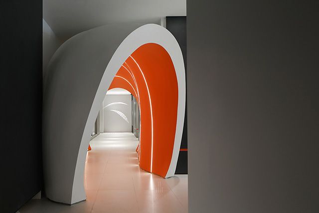
品界设计 - 桔子摄影苏州艺术中心 - 实景作品
室内设计:品界设计Interior Design: Scope Design主创设计:品界主创团队Creative Design: Scope Design Main Creative Team设计参与:品界深化团队Design Participation:Scope Design Deepen the team项目地址:江苏-苏州Project Address: Suzhou, Jiangsu空间类别:商业空间Space Category: Commercial Space设计风格:现代Design Style: Modernism项目面积:1600㎡Project Area: 1600㎡照明设计:有束光Lighting Design:DELICHT使用材料:Used Materials:艺术涂料,水磨石地砖,中灰色LG墙贴膜,深灰色LG墙贴膜,银灰拉丝仿不锈钢LG墙贴膜,长虹玻璃隔断,橙色涂料Art Paint, Terrazzo Floor Tiles, Medium Gray LG Wall Paper, Dark Gray LG Wall Paper, Silver Gray Brushed Faux Stainless-Steel LG Wall Paper, Changhong Glass Partition, Orange Paint1600m² 历时 8760h,大面积的品牌荧光橙加上极简的设计思维,简约时尚又不失艺术之美。1600m², 8760 hours, large area of fluorescent orange and minimalist design, simple and stylish without losing the beauty of art.1/位置Location项目落地苏州李公堤—苏州是一座历史文化名城,也是全国著名的风景旅游城市。李公堤是苏州高端文创艺术园区,年轻文创潮流达人圣地。这是一座新与旧合一,古韵文创极致的城市,桔子摄影选择在此入驻、创造和传承。The project is located on Ligongdi, Suzhou. Suzhou is a famous historical and cultural city and a famous scenic tourist city in China. Ligongdi is a high-end cultural and creative art park in Suzhou, a holy place for young cultural and creative trendsetters. This is a city where the old and the new are in one, and the ancient rhyme and the creation are extremely blended. Orange Photo chose to settle, create and inherit here.2/品牌Brand桔子摄影,14年专注原创外景婚照研发,在定义与重新定义的原创路上“我们在创造,也在发展”。2020年是不平凡的一年——新冠疫情来袭,桔子摄影作为沪上外景婚纱照领军品牌,砥砺前行,逆势突围,以上海为中心,新潮向前。Orange Photo, has focused on the research and development of original outdoor wedding photography for 14 years. On the path of defining and redefining original photography, "we are creating and developing."2020 is an extraordinary year—In spite of the outbreak of COVID-19, Orange Photo, as the leading brand of outdoor wedding photography in Shanghai, is still breaking through against the trend and forging ahead with Shanghai as its center.3/概念Concept从客户的角度出发,结合品牌概念,我们加以重新定义,以时尚、新潮的形象,改变中国婚照空间的“土、繁、著”此次的设计概念,设计师希望打破桔子摄影品牌原有的现代轻奢格调,将极简主义结合艺术画廊的形式来进行设计和构思。把前厅作为休闲的艺术画廊,用于熏陶客人对于婚纱摄影的艺术审美,让他们觉得桔子摄影不单只是拍拍婚纱照而已,它也可以是一种艺术作品,融于空间。再者结合他们全新升级的品牌吉祥物-桔熊和品牌色-荧光橙,将其应用在空间当中,让整个空间能够有属于桔子摄影的新品牌文化。From the customers’ point of view, combined with the brand concept, we redefine and change the "rustic and redundant" image of China's wedding photo space with a fashionable and trendy style.In this design concept, the designers combine minimalism with the form of an art gallery to design and conceive, so as to break the original modern light luxury style of Orange Photo. They design the front hall as a casual art gallery to edify the guests' artistic aesthetics for wedding photography, hoping to make them feel that Orange Photo is not only a place to take wedding photos, but also a work of art that blends into space. In addition, their newly upgraded brand mascots-orange bear and brand symbolic color-fluorescent orange are applied in the space, so that the entire space can have a new brand culture which only belongs to Orange Photo.4/设计Design这个空间分为四个部分:前厅区,接待区,选片区,办公区。前厅我们在做规划的时候,给它的定义是一个结合摄影作品的画廊,我们用 "积木" 的构思,将此空间体块化处理,同时在等待的座位区我们做了个抬高,这样可以把客人分流,避免在等待区域坐着等待的客人,受到人来人往的干扰,另一方面也增加了空间的层次感和画廊的趣味性。接着我们将一些立柱做成立体化但没有到顶的隔墙,它很大很厚,像积木一样穿插在这个画廊里形成挂画的背景墙,但我们在这个厚重的墙体里挖了个门洞,让客人可以自由穿梭,避免空间的呆板,增加逛的巧思,不想一样望穿所有。在这个休闲画廊里我们还设计了一个文创区域,将来这里会放置很多该品牌的文创产品来提供给客人,以增添品牌的文化内涵。用浅灰色和深灰色来渲染空间,提升空间的高级感,跳跃的荧光橙我们设计在部分墙壁的下方,作为引导色,避免太炸眼球。整个艺术前厅我们希望让在此等待的客人和刚进店的咨询客都能够感受到被这种艺术美感所熏陶和感染。This space is divided into four parts: the front hall area, the reception area, the selection area, and the office area.When planning the front hall, we defined it as a gallery combining photographic works. We used the concept of building blocks to block this space, and at the same time we raised the waiting seat area. In this way, the guests can be divided, and the guests sitting in the waiting area can be prevented from being disturbed by people coming and going. On the other hand, it also increases the sense of hierarchy of the space and the interest of the gallery. Then some pillars were made into a three-dimensional partition wall that did not reach the top. It was very large and thick, and interspersed like building blocks in this gallery to form a background wall for hanging paintings. In addition, we dug a door hole in this heavy wall to allow guests to travel freely, avoiding the dullness of the space as well as increasing the ingenuity of strolling. We don't want everything in the space to be looked through at once. In this leisure gallery, we have also designed a cultural and creative area. In the future, many special cultural and creative products will be placed here for guests to choose, which will enrich the cultural connotation of the brand. We also used light gray and dark gray to render the space to enhance the high-level impression to guests. In addition, we applied the jumping fluorescent orange under part of the wall as a guide color to avoid getting too eye-catching. We hope that the customers waiting here and those who have just entered the store can be influenced and infected by the artistic beauty of the entire front hall.在前厅通往接待区的过道,我们将一个橙色太空舱放在了走廊,搭配上一圈一圈的线条光,犹如穿梭了一般,来到接待区,在这里我们大量运用了太空银贴膜,进入前厅就像进入了一个极简的后现代太空船里,在这里有悬挂的艺术装置,在光影的结合下显得格外时尚,从而让这个销售商业氛围浓厚的区域变得艺术化。同时我们把销售的产品区和客户的谈单区结合在一块,便捷销售人员对一销产品的介绍,这样能更有利于签单。In the aisle leading to the reception area in the front hall, we placed an orange space capsule in the corridor with a circle of line lights. The guests come to the reception area through it, as if they have gone through a time and space shuttle. Here we used a lot of space silver wall paper. Walk into here just like entering a minimalist post-modern spacecraft. There are art installations hanging inside, which seems particularly fashionable under the combination of light and shadow. It will make this area with strong sales and commercial atmosphere become more artistic. At the same time, we combined the works display area for sales with the service consulting area for customers to facilitate the introduction of the one-stop wedding photography service by the sales staff, which will be more conducive to signing orders.在接待区与选片区的走廊我们设计了一个巨型内橱窗,里面放置着精美的婚纱礼服,在灯光的照耀下,显得高级感十足。每个主要的走廊的设计,都充满幻想与艺术。选片区与接待区是一个色系的格调,因为他们是承上启下的互通关系,在这里每个客人座位都是独立的半开放性,这样的接待方式既可以保证客户来此选片的私密性,也便于销售人员与客人的沟通。In the corridor between the reception area and the selection area, we designed a huge interior window. Exquisite wedding dresses are placed there and they look more high-class under the shining of lights. What’s more, the design of each main corridor is full of fantasy and art. The selection area and the reception area use the same color system, because they are a link between the previous and the next. Besides, each guest seat here is an independent semi-open reception. It can not only ensure the privacy of the customers to choose the photos, but also facilitate the communication between the sales staff and the guests.整个空间格局动线是层层递进的,每一个前区的设计都是为了后区去做铺垫。The moving line of the entire spatial pattern is progressive step by step, and the ingenious design of each front area is to pave the way for the back area.我们用艺术化的空间思维去做商业化的空间,见证婚纱摄影的空间设计 “商艺一体化”的时代已经到来。We use artistic spatial thinking to create commercialized space. The era of "integration of business and art" in wedding photography's space design has arrived.
版权所有 © 2015 - 2023 品界设计 闽ICP备20004985号-1

